I can see clearly now! Sign Legibility
When a customer comes in asking for you to make them a sign, you probably ask them a standard set of questions to determine the best option for their application. You ask what colors they want, indoor or outdoor, how do they want it mounted, and so on. But do you ask them from how far away they’d like the info on their sign to be legible?
Character legibility is an important consideration when creating a sign, and more often than not it’s something customers aren’t thinking about when they ask you to make them a new sign. Taking a few simple steps can help you make a sign your customer will love and will meet their expectations.
CONTRAST + CHARACTER HEIGHT = LEGIBILITY
There are two factors that go in to signage legibility: the color contrast of the characters against the background of the sign and the height of the characters relative to the distance the subject is viewing the sign.
The best place to start for color contrast is with the Americans with Disabilities Act (ADA). The ADA has set color contrast guidelines to make signage viewable for persons that are visually impaired. Those guidelines are a great place to start when trying to determine good color contrast for a sign. You can download a FREE copy of Rowmark's ADA Color Contrast Guide below.
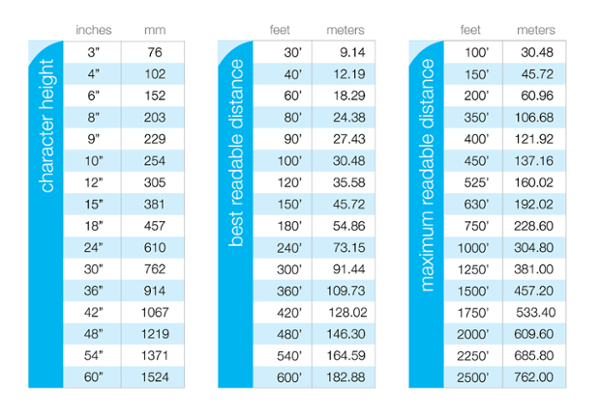
The second factor, character height, can be a bit more confusing. Character height for optimum visibility can depend on where the sign will be located, weather conditions of the location of the sign, and how far away the subject is from the sign.
Below is a handy chart that can act as a guideline for optimum and maximum legibility based on character height and the distance at which the sign is being viewed.

Distance Legibility Chart for Signage
DON’T FORGET ABOUT FONT STYLE
Font style choices can also impact the legibility of a sign. Obviously a 9” tall thin, script font on a decorative sign won’t be as legible at a distance as a thicker, sans-serif font on a safety sign. Be sure to work with your customer and clarify the purpose of the sign and suggest a font style that fits their objective.
Taking contrast and character height into account when you’re creating signs for customers will help ensure you’re supplying them with signs that will work for their application. Just a few simple questions and professional suggestions from you will get them a sign they’ll love…and keep them coming back for more!
