Creating a College and University Signage Program: Part 3 - Recognition Wall
The Findlay Heroes Wall
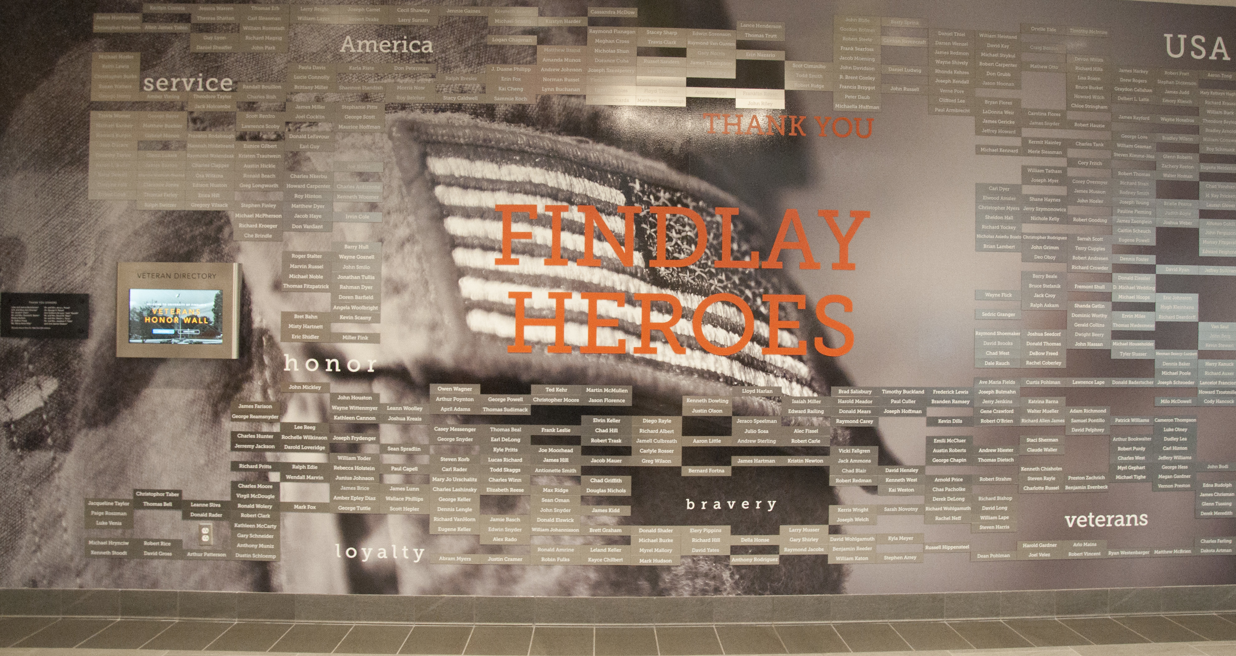
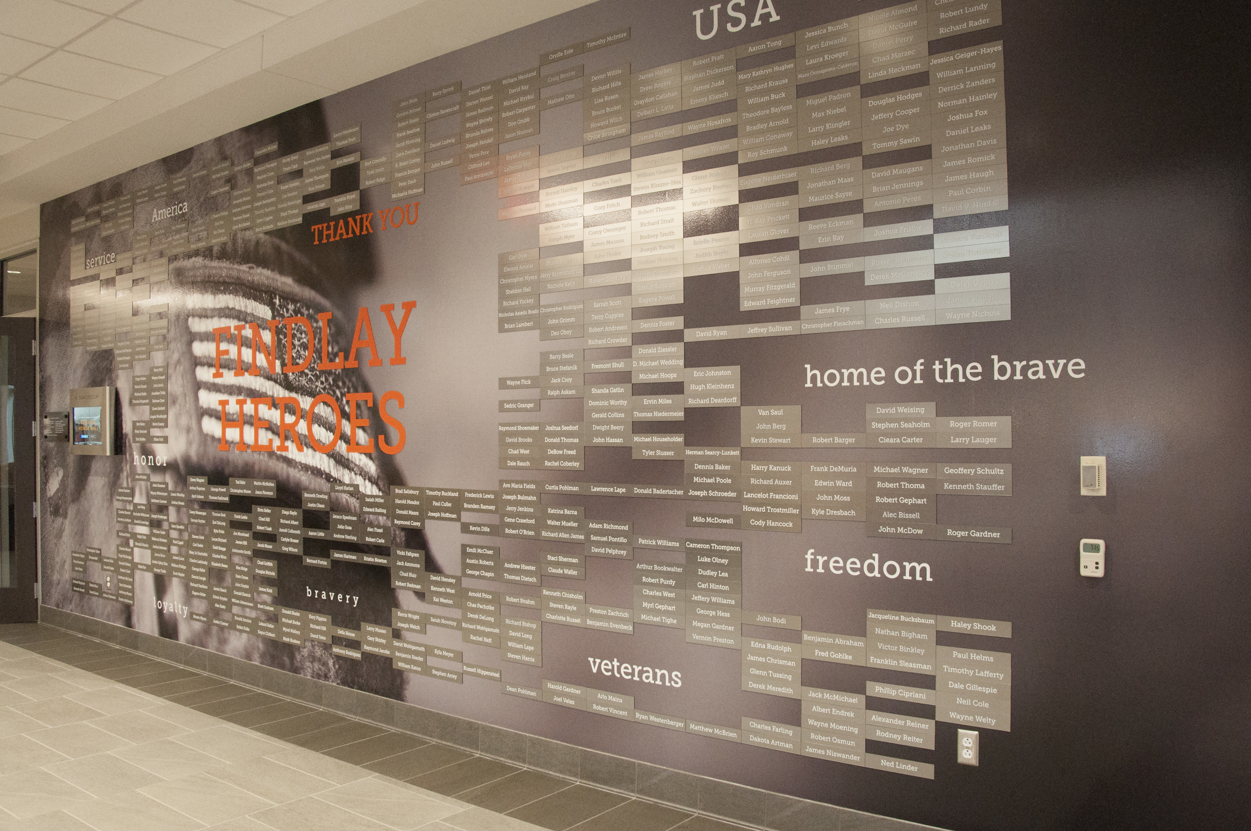
The centerpiece of the entire signage project was a large scale donor-style wall highlighting local veterans and military personnel. A floor-to-ceiling graphic of a military uniform serves as a backdrop for the veteran names. Here, we see the design elements that will carry throughout the rest of the building signage.
Being the focal point of the signage install, it was important for this piece to “set the tone” for the rest of the signs throughout the building. The colors, materials, and fonts used on this wall will be used in all other signage in the building, creating a cohesive look.

Local veterans honored at The University of Findlay
University Branding
The most important part of this project was to ensure that the University’s brand identity and standards were followed as closely as possible. That included coordination with the sign fabricators, interior designers, and representatives of the University’s marketing department.
The University of Findlay’s primary color is orange with black as a secondary color, and those are the colors you’ll see represented throughout the project. In order to reinforce the primary color, the decision was made to use orange for the large “FINDLAY HEROES” in the center of the wall. The orange contrasted nicely with the grayscale backer image and allowed the designers to use white as a secondary font color.
Working Together
The sign fabricators, with approval from the University marketing department, found a material that closely matched the official University Pantone orange. This is an instance where working in partnership with the University representatives was vital. While the initial spec for the project called for an exact match to the Pantone color, finding a close approximation saved time and money from having additional materials custom fabricated.
In the end, the designers were happy that they were able to execute their vision, the sign fabricators were happy to use a material that was readily available, and the University was happy to have their brand standards followed as closely as possible.

How It Was Made
The “FINDLAY HEROES” graphic was made by routing out letters from a 1/8” matte finish orange acrylic (1). The white stand-alone wording used on the wall were created by laser vector cutting 1/8” extruded acrylic (2). Finally, the veteran nameplates were created using UV-LED printed lettering on a smooth silver 1/16”extruded acrylic (3). The University supplied the interactive LCD screen on the left-hand side of the display. This allows visitors to look up information about the veterans whose names appear on the wall (4).
- – 1/8” Rowmark UltraMatte Reverse, Matte/Orange JPPlus item #342651
- – 1/8” Rowmark ADA Alternative, Bright White, JPPlus item #341204
- – 1/16” Rowmark LaserMax Reverse, Clear/Smooth Silver, JPPlus item # 922341, printed on DCS UV-LED printer
- – Interactive LCD display provided by client
If you missed parts 1 and 2 of this blog series, you can find them here:
Creating a College and University Signage Program: Part 1 - Overview
Creating a College and University Signage Program: Part 2 - Donor Room Signage

